The traditional laboratory report is undergoing a massive transformation. For decades, the pinnacle of scientific achievement was a densely packed, text-heavy paper published in a black-and-white journal. However, as we move through 2026, the “ivory tower” of academia is opening its doors to a more visual, interactive form of communication. Today’s science undergraduates are no longer just researchers; they are becoming digital storytellers. The shift toward custom design tools isn’t about making things look “pretty”—it is about making complex data understandable in a world that suffers from information overload.
The primary driver of this change is the sheer volume of data produced in modern STEM fields. Whether you are analyzing genomic sequences or tracking climate change variables, raw data is often unintelligible to the naked eye. To bridge the gap between discovery and comprehension, students are increasingly seeking specialized support. For instance, many find that partnering with a professional assignment helper allows them to structure their technical findings into a narrative that resonates with both professors and peers. This collaborative approach ensures that the core science isn’t lost in a sea of poorly organized paragraphs, allowing the student to focus on the creative aspects of their data presentation.
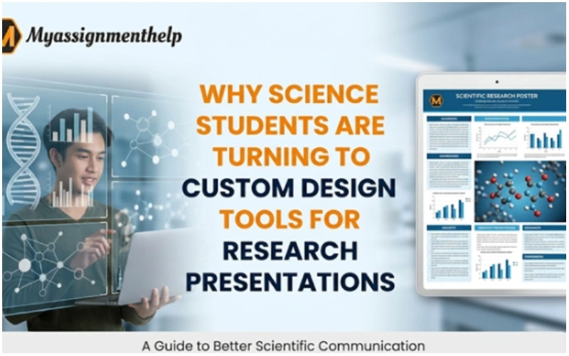
The Evolution of the Scientific Poster
In the past, a scientific poster for a symposium was often a collection of taped-up A4 sheets. Today, students utilize platforms like MyStyle to create high-resolution, custom-branded layouts. These tools allow for the integration of vector graphics, which maintain their clarity even when printed on large-scale fabric or vinyl.
Custom design tools offer several advantages over generic templates:
- Precision: Tools that allow for “pixel-perfect” alignment help in displaying microscopic imagery.
- Brand Consistency: Students representing specific labs can maintain color schemes and typography that align with their university’s identity.
- Interactivity: Digital-first presentations now include QR codes that link to live data sets or 3D molecular models.
Why Visual Literacy is the New “Writing”
We often hear that “coding is the new literacy,” but for science students, visual literacy is just as critical. A researcher who can design a clear flowchart of a chemical reaction is often more successful than one who writes three pages describing it. This is because the human brain processes images 60,000 times faster than text. For an undergraduate student, mastering this skill is the difference between an “A” and a “C.”
| Feature | Generic Templates | Custom Design Tools |
| Flexibility | Rigid, hard to modify | High; supports custom dimensions |
| Data Integration | Manual entry | Dynamic linking and SVG support |
| E-E-A-T Signal | Low; looks like every other student | High; shows professional effort |
| Engagement | Passive reading | Active visual exploration |
Solving the “Information Gain” Puzzle
Google’s search algorithms now prioritize what experts call “Information Gain.” This means that if your research presentation or blog post simply repeats what is already on Wikipedia, it won’t rank. You need to provide unique insights. Science students are using design tools to create original infographics that synthesize multiple studies into one “master visual.”
When the workload becomes overwhelming—especially during finals week—maintaining this level of quality is tough. This is where many students turn to Myassignmenthelp Services for science assignment help to ensure their technical accuracy is as sharp as their visual design. By outsourcing the heavy lifting of literature reviews or data verification, students can spend their energy on the “Information Gain” aspect of their presentation, ensuring they provide a perspective that is fresh and unique to their specific research.
Cognitive Load and the Undergraduate Audience
One of the biggest mistakes undergraduates make is trying to show everything at once. Custom design tools allow for “progressive disclosure.” This is a design technique where you show the most important data first and hide the complex details in sub-menus or secondary charts.
By reducing the cognitive load on the audience, the presenter ensures that the “Big Idea” is remembered. If you are presenting to a global audience, your visuals must transcend language barriers. A well-designed diagram of a neural network can be understood by a student in Tokyo just as easily as a student in New York, whereas a dense English paragraph might pose a challenge.
Technical SEO for Academic Blogs
If you are publishing your research online, ranking on the first page of search results is the ultimate goal. To achieve this, your content needs to be structured for both humans and bots.
- Use Descriptive Alt-Text: Don’t just name an image “Graph1.” Use “Line graph showing the 20% increase in CO2 absorption by phytoplankton.”
- Semantic Headers: Use H2 and H3 tags to break up your content into logical sections.
- Mobile Optimization: Most students view content on their phones. Ensure your custom charts are responsive and readable on small screens.
The Shift Toward “Bespoke” Learning
The move toward custom tools mirrors a larger trend in education: the move away from “one-size-fits-all.” Just as a student might customize a WordPress site to fit their personal brand, they are now customizing their education. They are choosing tools that fit their specific learning style—whether that involves high-end graphic design, AI-assisted data modeling, or professional academic consulting.
In conclusion, the marriage of science and design is not a trend; it is the future of the industry. As professional environments become more competitive, the ability to communicate “The Why” behind “The Data” will be the defining skill of the next generation of scientists. By embracing custom design tools, students are not just finishing an assignment; they are building a professional portfolio that speaks to their authority and expertise.
Frequently Asked Questions (FAQ)
Q: Do I need to be a graphic designer to use these tools?
Ans: No. Many modern platforms offer “drag-and-drop” functionality. The goal isn’t to become an artist, but to use design to clarify scientific facts.
Q: Will using design tools help my grades?
Ans: Most rubrics for research presentations include points for “clarity of communication.” Better visuals almost always lead to better engagement from professors.
Q: How do I ensure my infographics don’t look spammy?
Ans: Focus on data first. Use a clean aesthetic, avoid “neon” colors, and ensure every visual element serves a purpose. If a design element doesn’t help explain the science, remove it.
Q: Can these tools help with complex STEM subjects like Physics or Chemistry?
Ans: Absolutely. Visualizing 3D molecular structures or force-vector diagrams is much more effective than 2D sketches.
Q: Is it okay to seek help with the writing part of my assignment?
Ans: Yes, many students use professional services to help organize their thoughts and ensure their grammar and structure meet academic standards, allowing them to focus on the research itself.